The short version
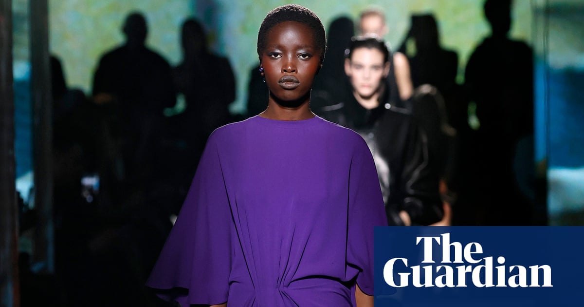
- Major fashion houses including Balenciaga and Celine have featured all-purple designs on their autumn catwalks.
- Industry analysts attribute the trend to a growing consumer appetite for brighter colors following years of restrained neutral aesthetics.
- The color's historical associations with royalty and power continue to influence its modern appeal in both physical and digital contexts.
The fashion industry is witnessing a significant shift in color preferences for the autumn and winter seasons, with purple emerging as the dominant hue. Major luxury brands such as Balenciaga, Celine, and Valentino have showcased extensive collections featuring this vibrant shade on their recent catwalks. This widespread adoption signals a clear departure from the muted neutrals that have characterized high fashion over the past few years. The trend is not confined to high-end runways; it has permeated the broader market, with accessible retailers like H&M, Cos, and Asos offering purple knitwear and accessories to meet rising consumer demand.
This season’s specific iteration of the color has been labeled royal purple, characterized by its vivid intensity rather than the darker plum or softer lilac tones seen in previous cycles. Designers are increasingly pairing this bright shade with red, creating what industry publications describe as a striking color clash. Celebrities including Jennifer Lawrence and Zoë Kravitz have been observed wearing these bold combinations, further cementing the trend’s visibility. The strategic use of high-contrast pairings suggests that brands are aiming for maximum visual impact, leveraging the inherent boldness of purple to capture attention in an increasingly crowded marketplace.
Industry experts point to a broader cultural shift driving this change. Sara Maggioni, head of womenswear at trend forecasting agency WGSN, notes that consumers are moving away from the restraint associated with quiet luxury. There is a growing appetite for more expressive shades as individuals become more confident in using color to articulate their personal style. This transition reflects a desire for individuality and vibrancy after a period defined by subtlety and understatement. The prediction of this trend was made as early as 2024, when WGSN identified fresh purple as a key color for the upcoming autumn season.
The historical weight of purple adds another layer to its current popularity. Historically, the color has been inextricably linked to royalty, wealth, and power. Ancient Romans used Tyrian purple, a dye derived from mollusc secretions near the city of Tyre, which was so expensive that it became a symbol of imperial status. Although the original method for producing this dye was lost following the decline of the Byzantine Empire, the cultural association between purple and authority has persisted. Kassia St Clair, author of The Secret Lives of Colour, observes that these deep-seated connections remain part of the collective consciousness, even if many people are unaware of the specific historical origins.
The modern accessibility of purple dye dates back to 1856, when chemist William Henry Perkin accidentally created a bright purple liquid while researching malaria treatments. This synthetic dye, known as mauve, democratized access to the color, leading to a surge in popularity among the Victorian elite, including Queen Victoria. The phenomenon was so widespread that contemporary satirical magazines joked about everyone catching the mauve measles. Today, the ease of production allows for the vivid, saturated tones seen on current runways, bridging the gap between historical exclusivity and modern mass appeal.
Beyond history and accessibility, the color’s suitability for digital environments is influencing its adoption. Maggioni describes purple as having a phygital quality, meaning it performs well in both physical settings and virtual worlds. Its vivid, slightly otherworldly character makes it ideal for digital imagery and immersive environments where colors can be intensified and transformed. As fashion increasingly intersects with digital media and virtual experiences, colors that translate effectively across these platforms gain strategic importance. This dual functionality enhances purple’s relevance in a landscape where online presence is as critical as physical retail.
Practical considerations also play a role in the season’s color palette. Fashion editors note that red and purple align well with the natural tones of autumn and winter, reminiscent of heather and rosehips. The darker evenings of the colder months provide a backdrop that complements the depth and richness of these hues. Daisy Murray, fashion commerce editor at Grazia, admits to initially disliking the trend but found that the punchy nature of purple made sense as a bold alternative to red, which she typically favors in summer. This seasonal appropriateness helps ground the trend in reality, making it feel both timely and contextually relevant.
The resurgence of purple illustrates how fashion trends are shaped by a complex interplay of historical symbolism, consumer psychology, and technological adaptation. As brands move away from the safety of neutrals, they are embracing colors that offer strong visual statements and emotional resonance. The success of this season’s purple collections suggests that consumers are ready for more expressive choices, marking a potential turning point in contemporary style. Whether this represents a lasting shift or a temporary burst of vibrancy remains to be seen, but the immediate impact on the industry is undeniable.
Sources behind this briefing
Go to the original reporting
- The Guardian World↗Prince, the pope, and autumn 2026: purple is hot this season